

Everyone sees the same truth
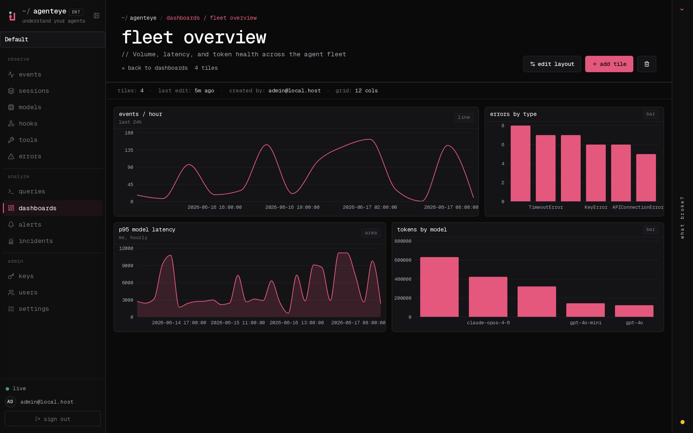
Stop pasting screenshots into chat and stop re-running the same query five times a day. A dashboard is a shared, org-wide board anyone on your team can open to the exact same view. When the underlying data moves, the charts move with it, so the board is always current and nobody is arguing over stale numbers. The fleet dashboard above is a good starting shape for day-to-day operations:- an events-per-hour line, so you can watch throughput and catch a sudden drop
- an errors-by-type bar, so your biggest failure categories jump out
- a latency area chart, so slow-downs show up before users complain
- a tokens-by-model breakdown, so cost stays in view
/<org-slug>/dashboards.
Pin the queries you already saved
Every tile starts as a saved query. Build and save the query you care about in the Queries library (built-in presets plus your own, over your events and evaluations), then pin it to a dashboard as the chart that fits the data: a line for trends over time, a bar for comparing categories, an area for volume, or a pie for a share breakdown. Because a tile is just your saved query rendered as a chart, there’s nothing to keep in sync by hand. Update the query once and every dashboard that uses it updates too.Watch quality, not just volume
Volume tells you the agents are busy. Quality tells you they’re actually doing the job. Point a dashboard at your evaluation scores and you get a board that tracks how well runs are going over time, so a quality regression shows up as a dip on a chart instead of a surprise from a customer.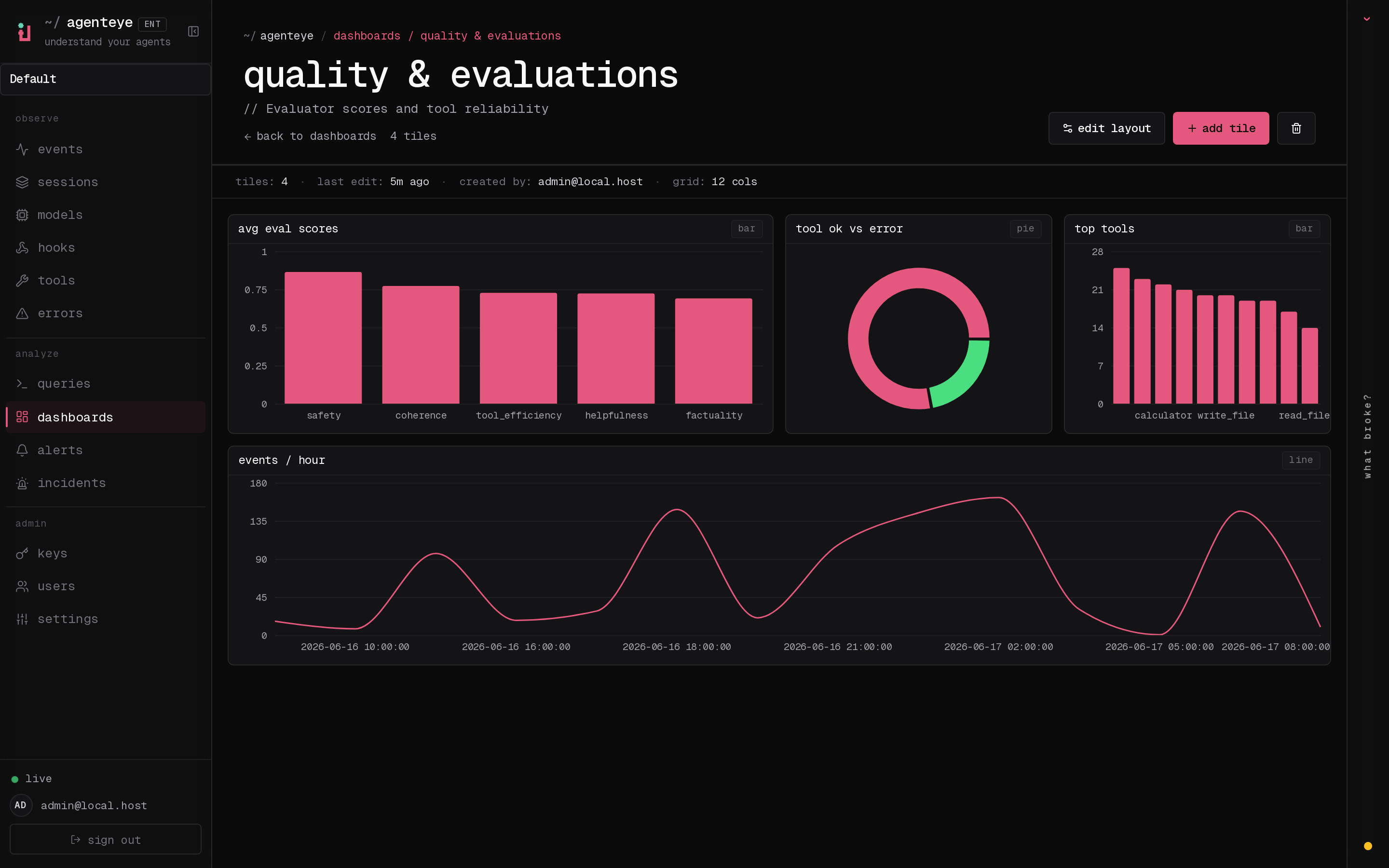
Related
- Queries: build and save the queries that become your tiles.
- Evaluations: score your runs so you can chart quality over time.
- Alerts: turn a threshold on any of these metrics into a page.