

Stop letting averages hide your worst runs
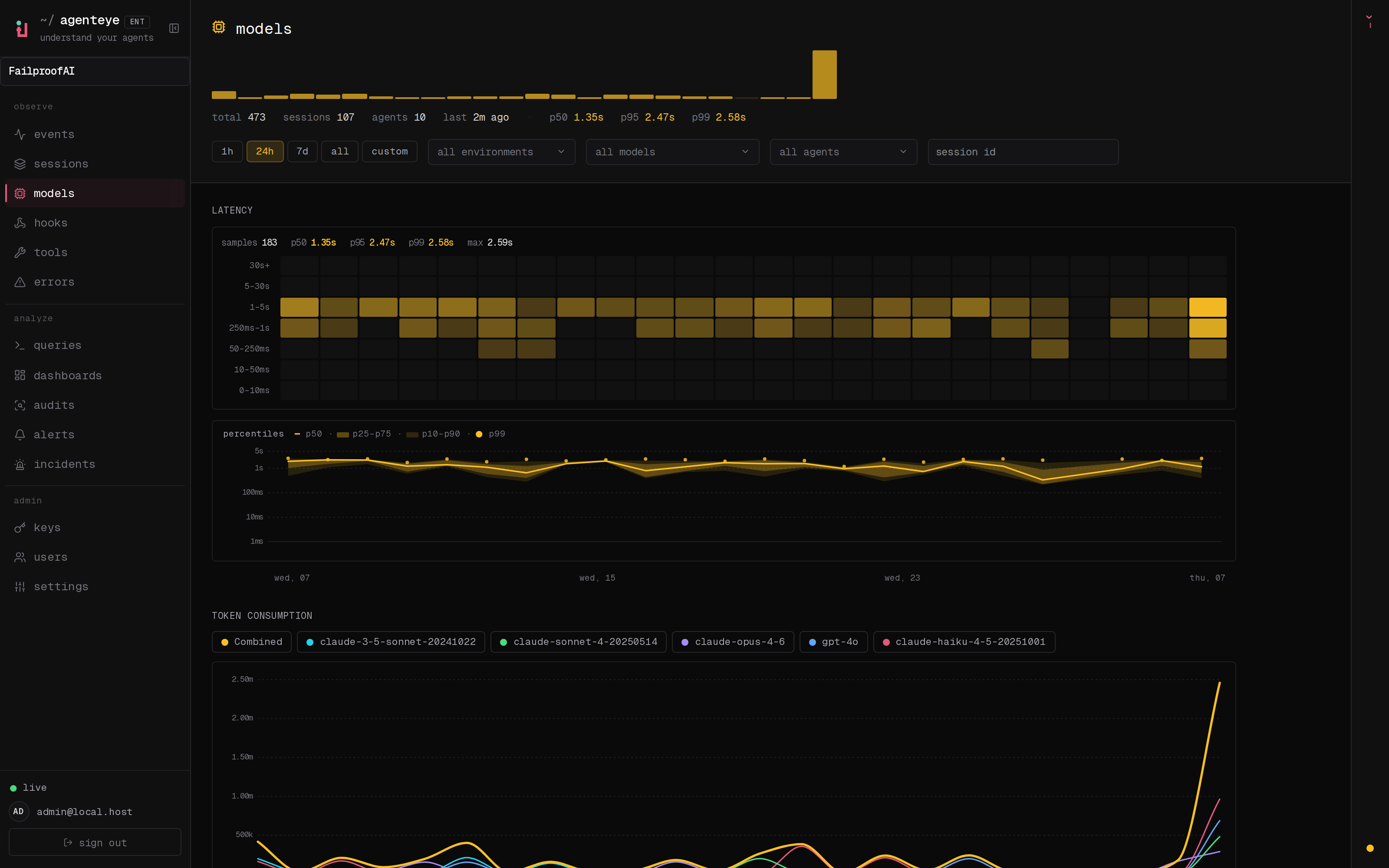
An average latency number is comforting and useless: it smooths over the one call in fifty that stalls and pages your on-call at 2am. The Models, Tools, and Hooks pages refuse to do that. Each shares the same shape, so you learn it once:- A 24-bin sparkline for the trend at a glance: is this getting worse?
- A vitals strip with p50, p95, and p99 latency, so the typical run and the tail sit side by side.
- A latency heat-map, 24 time bins by latency buckets, that shows when the slow calls clustered.
- A percentile band: a p50 line with p25 to p75 and p10 to p90 shaded ribbons and p99 dots, so the spread stays visible instead of averaged away.
Models: see exactly what each model costs you
The Models page (shown up top) answers the two questions a bill always raises: which model, and how much. On top of the shared latency view, it adds per-model token consumption, estimated cost, and context-window fill, so runaway prompt growth and an impending compaction are visible before they surprise you. FailproofAI Observability recognizes common model IDs automatically. If a window looks wrong, or you run a private model of your own, correct it or add one under Settings, in model context windows, and the fill readouts follow.Tools: tell the slow apart from the broken
A tool call can be slow, or it can be quietly failing, and you want to know which one in seconds, not after digging through logs.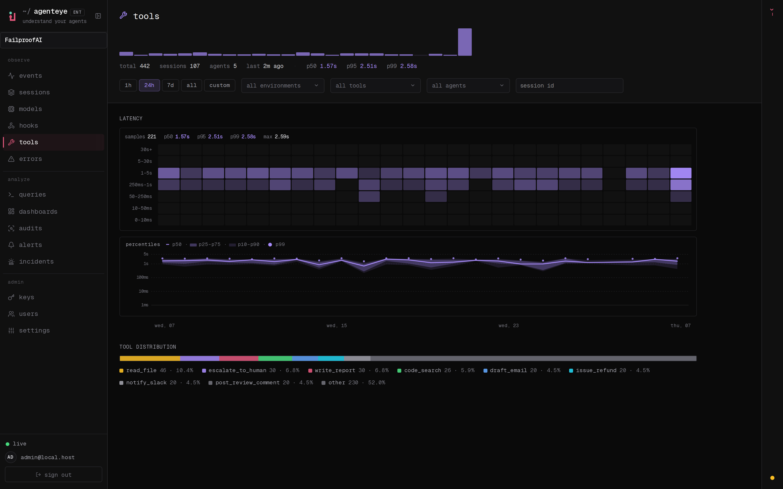
Hooks: pinpoint the exact hook and trigger
When a lifecycle hook drags a run, “hooks are slow” is not something you can act on. The Hooks page gets you to the one that matters.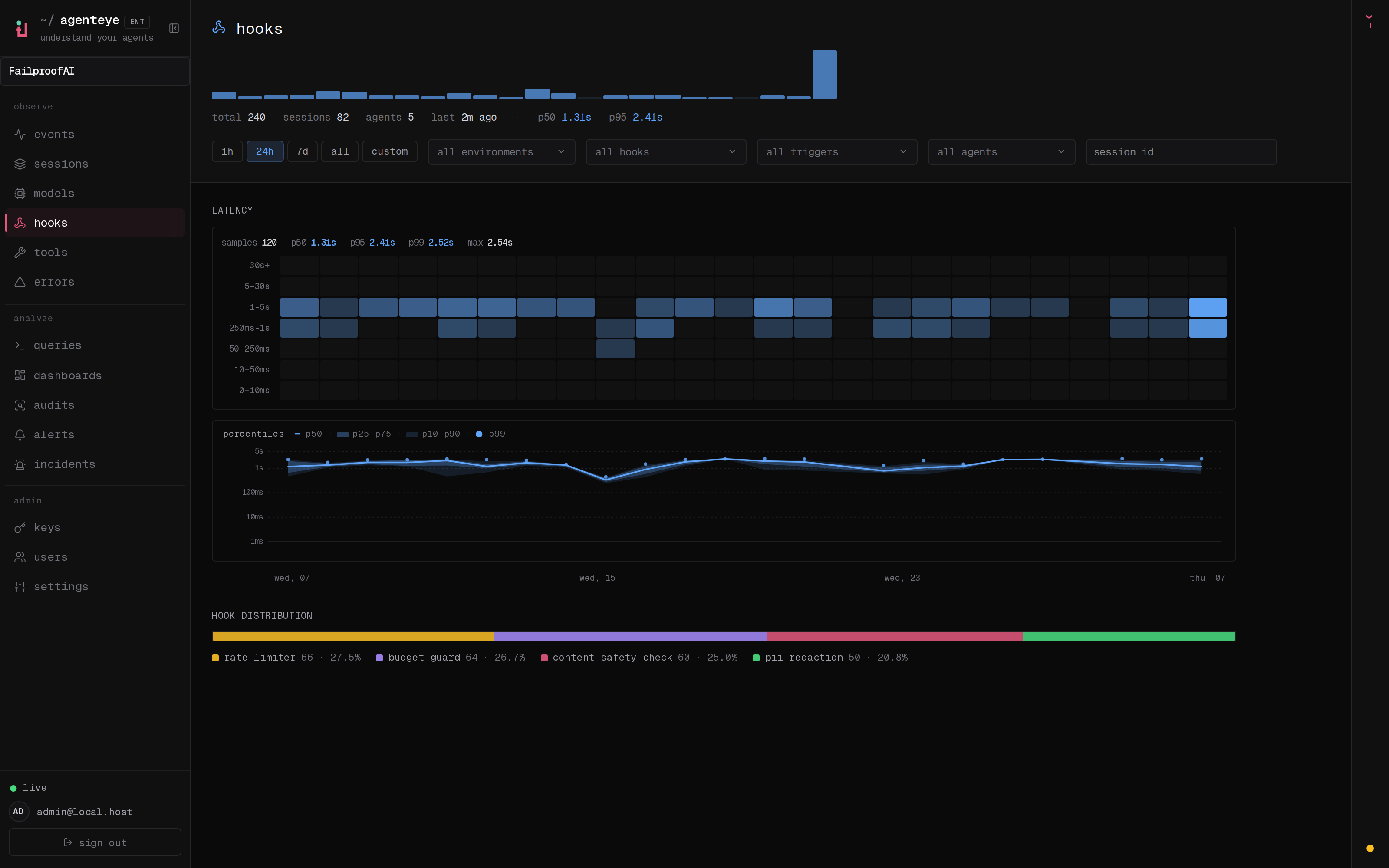
Related
- Event stream: the live, colour-coded trail of every event.
- Sessions: roll events up into one row per run and open its execution graph.
- Error tracking: one triage surface for everything the dashboard paints red.
- Dashboards: roll-up views across your fleet.